FitJourney
My role
UX Research, UX/UI Design
Overview
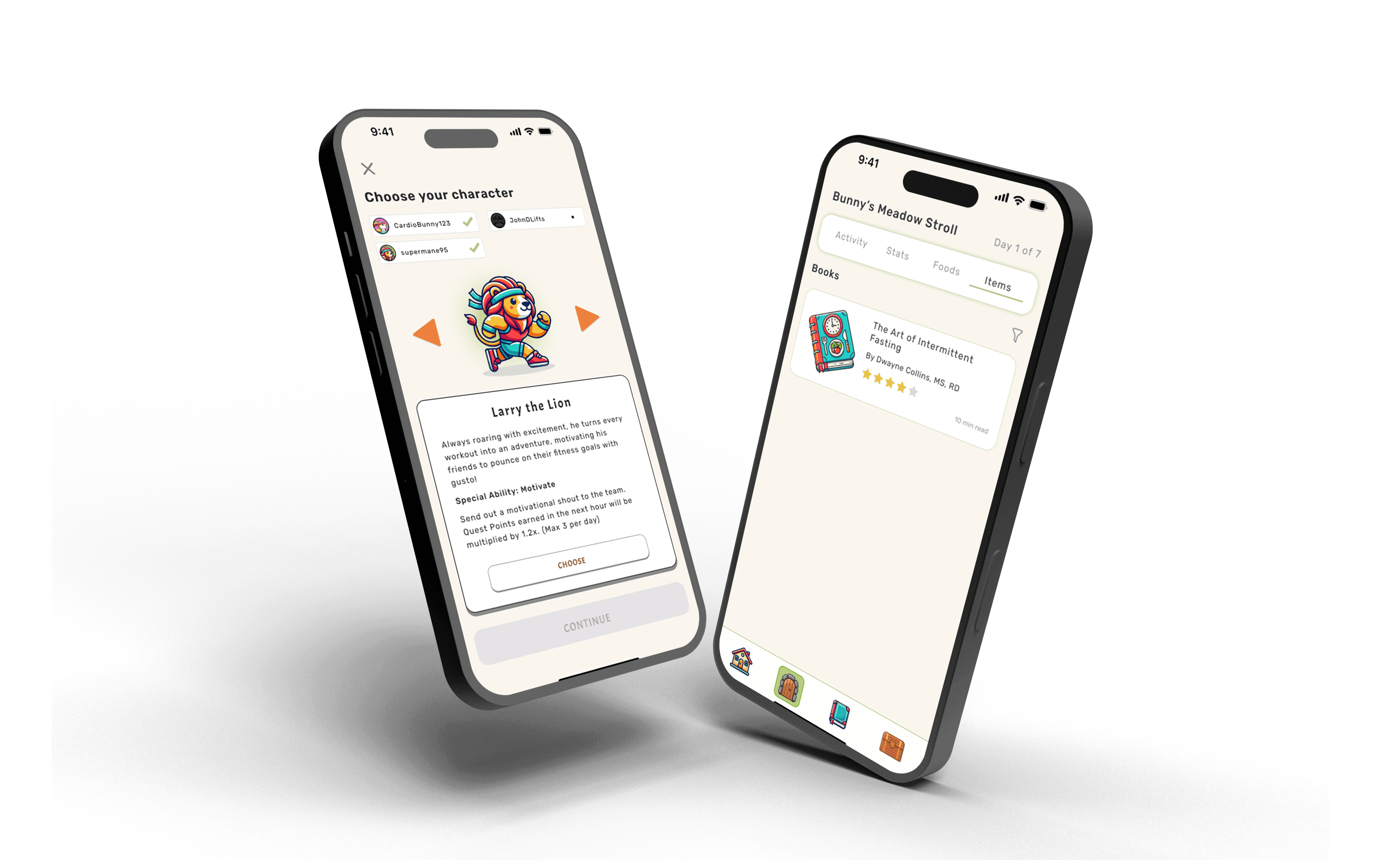
FitJourney is a health and fitness tracking app that transforms the tedious process of tracking into a game-like experience. Drawing inspiration from the highly successful gamification elements of Duolingo, I aimed to infuse the app with interactive, playful components that motivate users, maintain their accountability, and ultimately, guide them towards a healthier lifestyle.
Background
People who want to be healthier often turn to health and fitness tracking apps as a source of guidance and accountability.
While these apps are packed with useful features, they often fall short in sustaining user engagement. According to statistics gathered by media.market.us, 70% of users abandon health-tracking apps within the first two weeks if they find the app too complex or time-consuming.
This not only leads to potential loss of revenue and lost opportunities for businesses, but users also experience lack of consistent support with their health goals, frustration and wasted effort, and a diminished sense of community due to lack of active users.
With this project, I sought to identify and address key pain points with a design-first approach, focusing on user needs, behavioral psychology, and engagement strategies.
UX Research
User interviews
Interviews were conducted with 3 people who currently or have used fitness-tracking apps in the past.
The goal was to get a better understanding of their motivations for using the app, what worked, didn’t work, and what they felt like could be improved.
Secondary research
I also searched the web for detailed reviews and articles on popular health-tracking apps such as MyFitnessPal and Fitbit.
A common complaint was that the apps induced negative psychological pressures for users to maintain their streaks and hit their daily activity goals.
Research findings
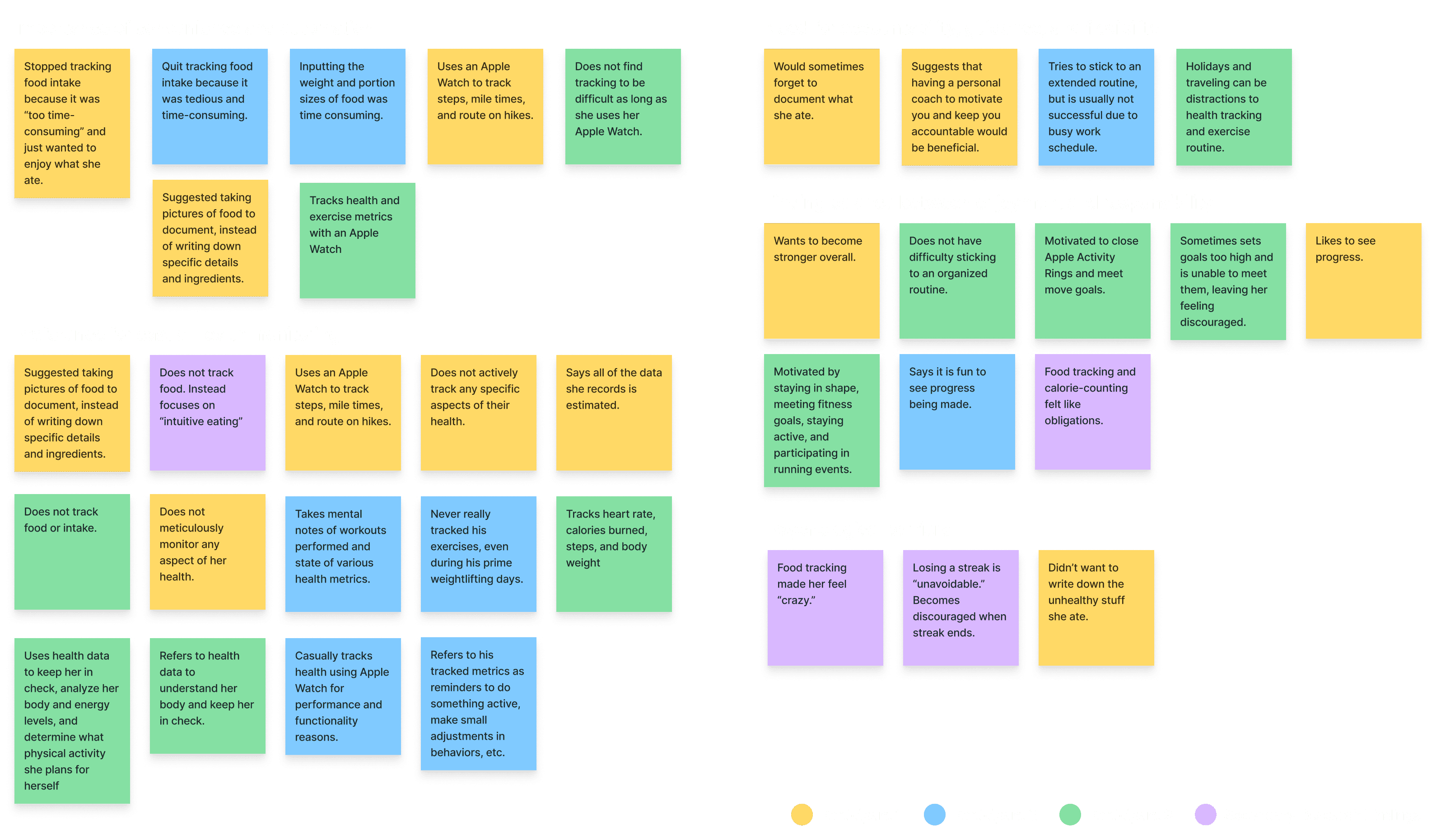
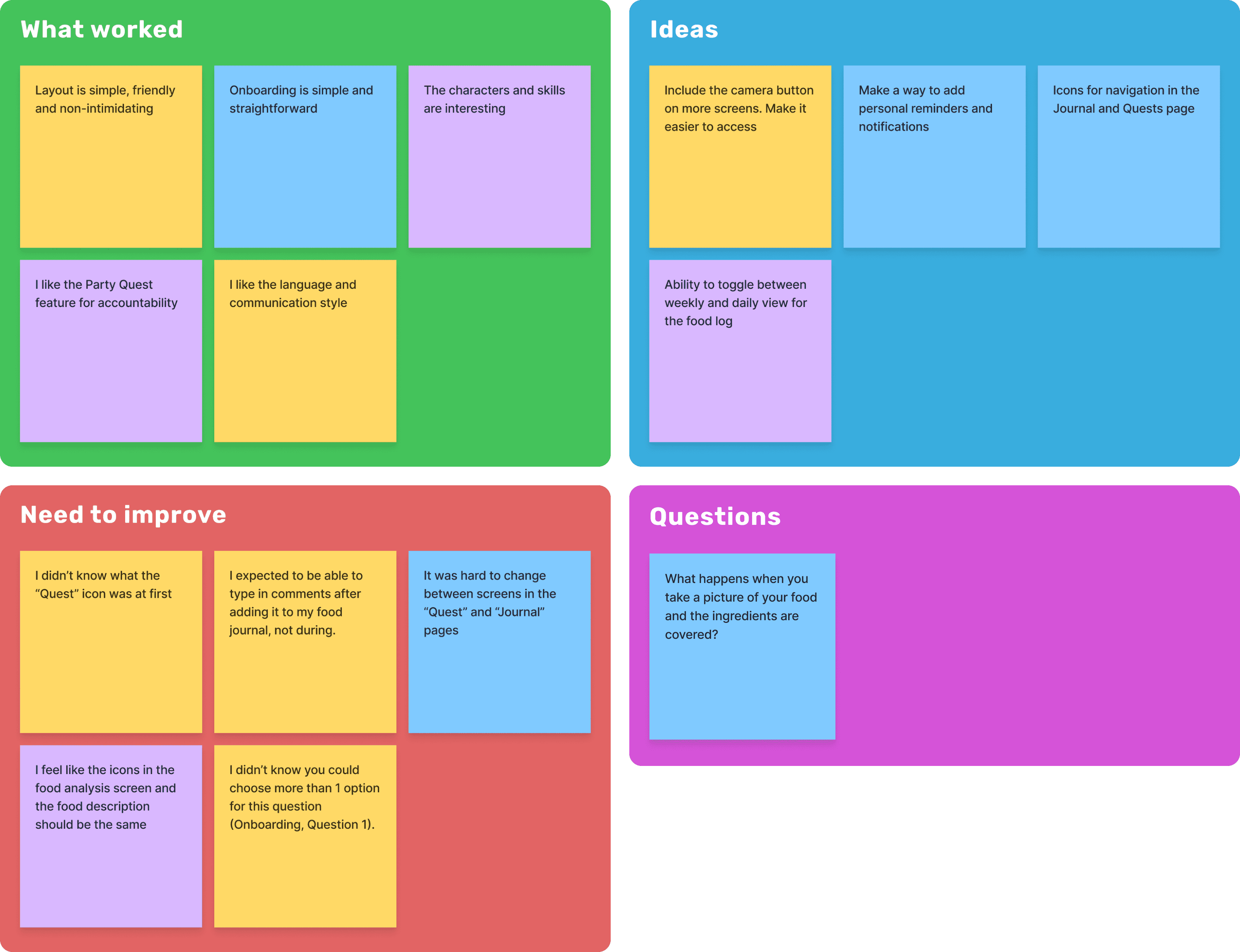
After organizing my research notes into an affinity map, some common themes were identified:
Importance of convenience and automation
Balance between enjoyment and responsibility
Need for accountability, guidance, and flexibility
Affinity for casual health monitoring
Psychological barriers
Reframing the problem
I narrowed the problem down to an ineffective approach to food-tracking and calorie-counting.
Many users stop using health-tracking apps due to complex interfaces, time-consuming food tracking methods, or being overwhelmed by psychological pressures to maintain streaks and goals.
Ideation
Defining the target audience
Based on the research, this app will be for a health-conscious audience that values casual, convenient health and food-tracking features. These individuals want to improve or maintain their health without having the negative psychological pressure of meticulously tracking their intake, and maintaining daily streaks.
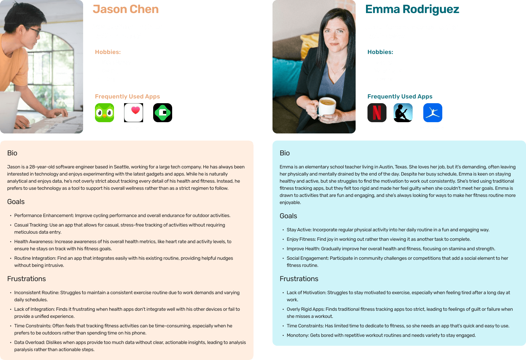
User personas
Two user personas were created based on information gathered from initial user research and interviews. The goals and frustrations of these personas will be considered when developing features for the app.
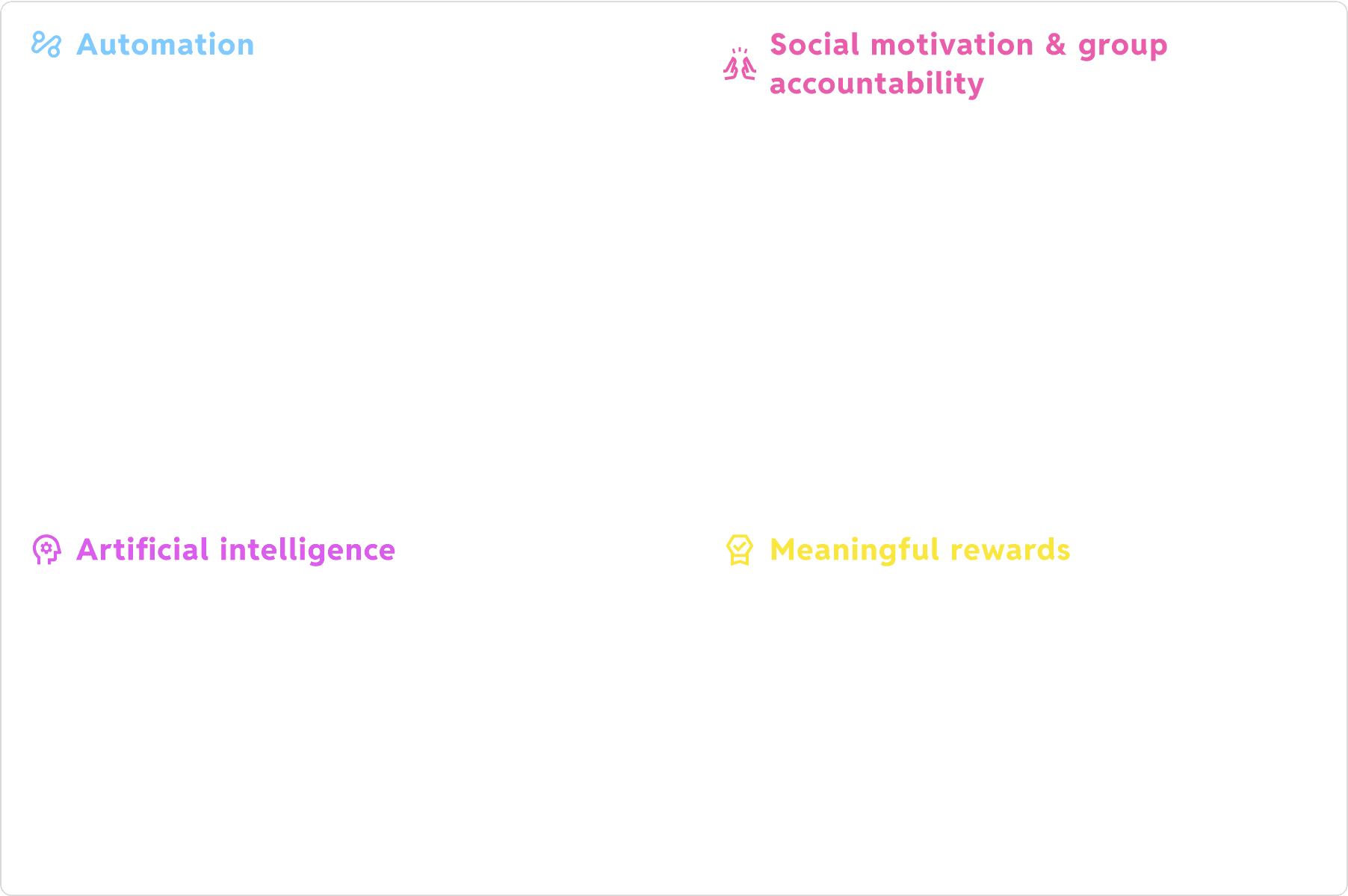
Addressing key themes
I brainstormed solutions while keeping the following themes in mind:
Proposing a solution
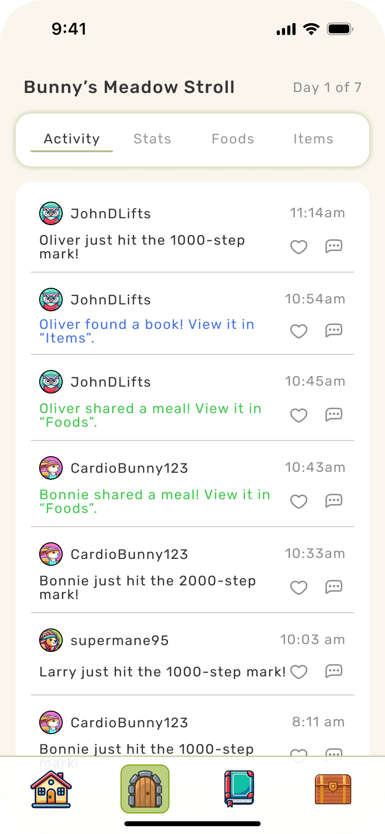
We will create a gamified health and fitness tracking app that leverages automation and artificial intelligence to reduce manual input. The app will draw on social motivation, group accountability, and meaningful rewards to drive user engagement and satisfaction.
UX Design
Information Architecture
User Flows
Three user flows were created to map out key features of the app.
The “Onboarding” flow was created to show how new users will be prompted to join a new Party upon completing registration.
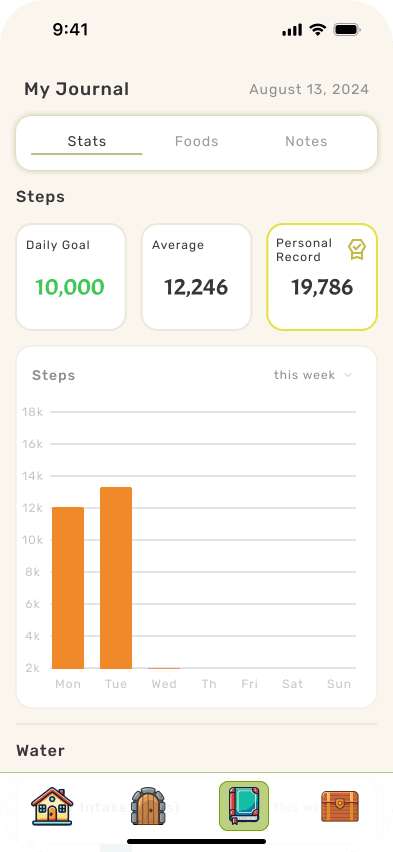
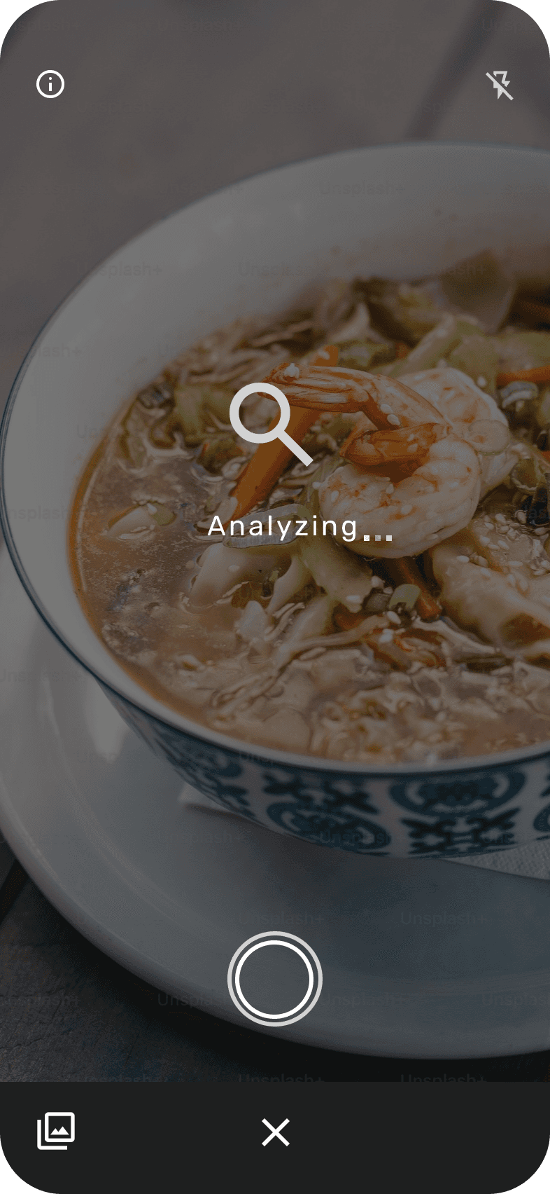
The “Using the food camera” flow shows the app’s AI capabilities and ease of logging a meal into the Food Journal.
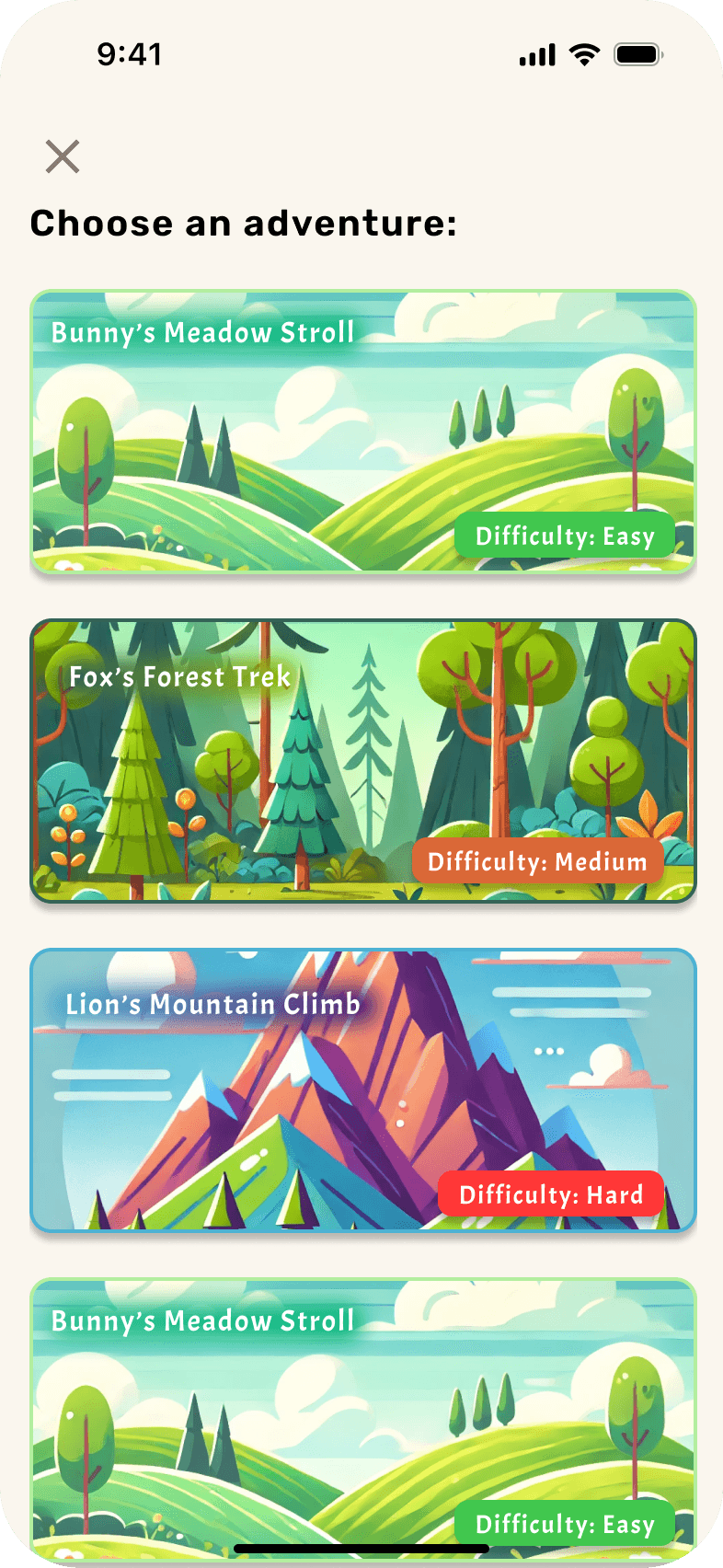
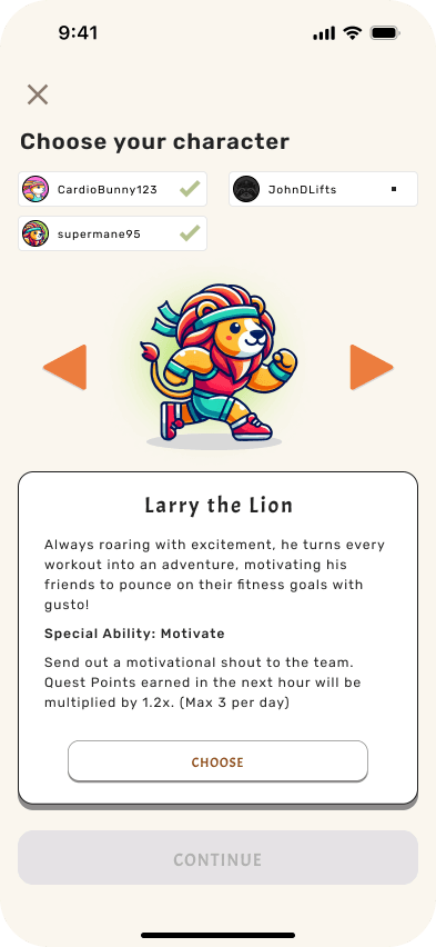
The “Join a Party Quest” flow maps out the process of starting a new Party Quest.
Onboarding
Using the food camera
Join a Party Quest
Wireframes
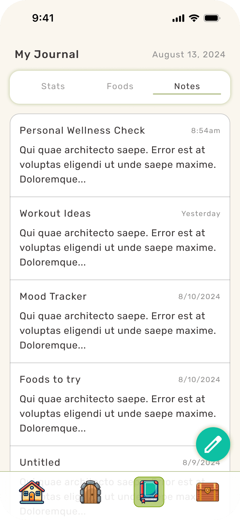
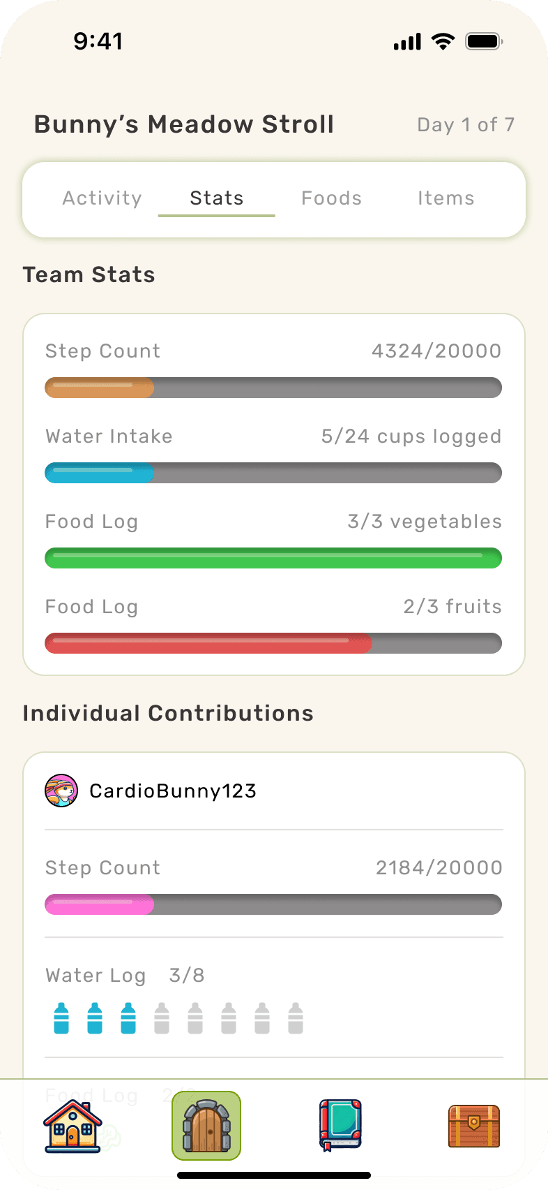
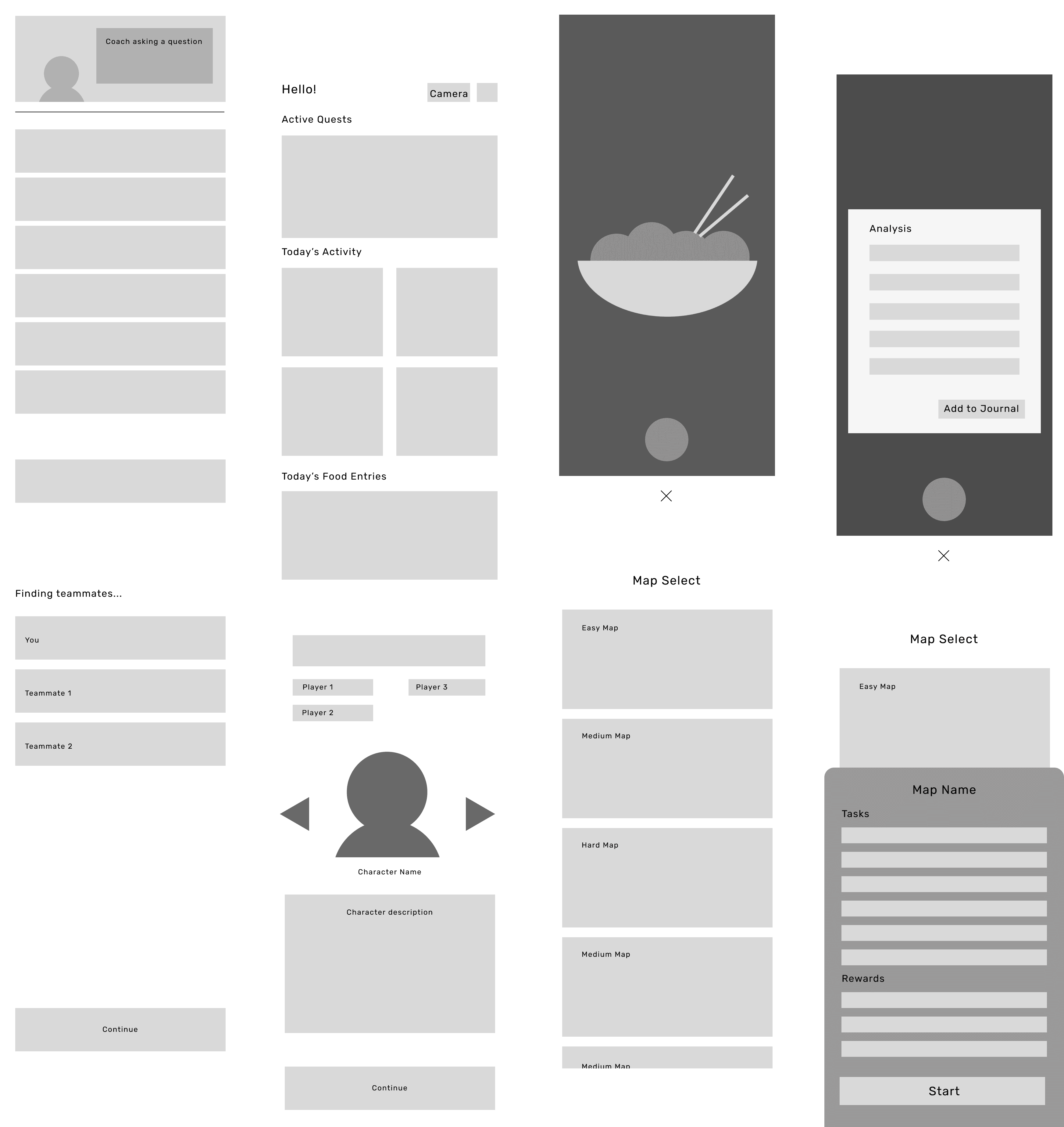
Some lo-fi wireframes were created to communicate layout and functions for key screens from the chosen user flows.
These screens include:
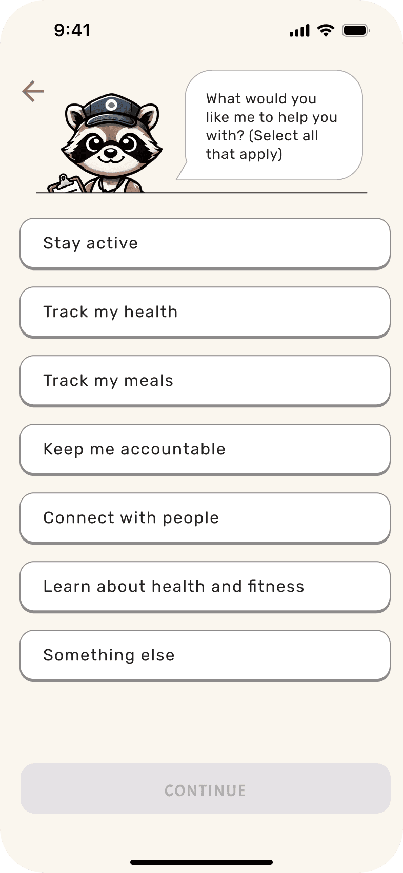
Onboarding Questions
Dashboard
Food Camera & Analysis
Joining a new Party Quest
Map/Difficulty Selection
UI Design
Brand Identity
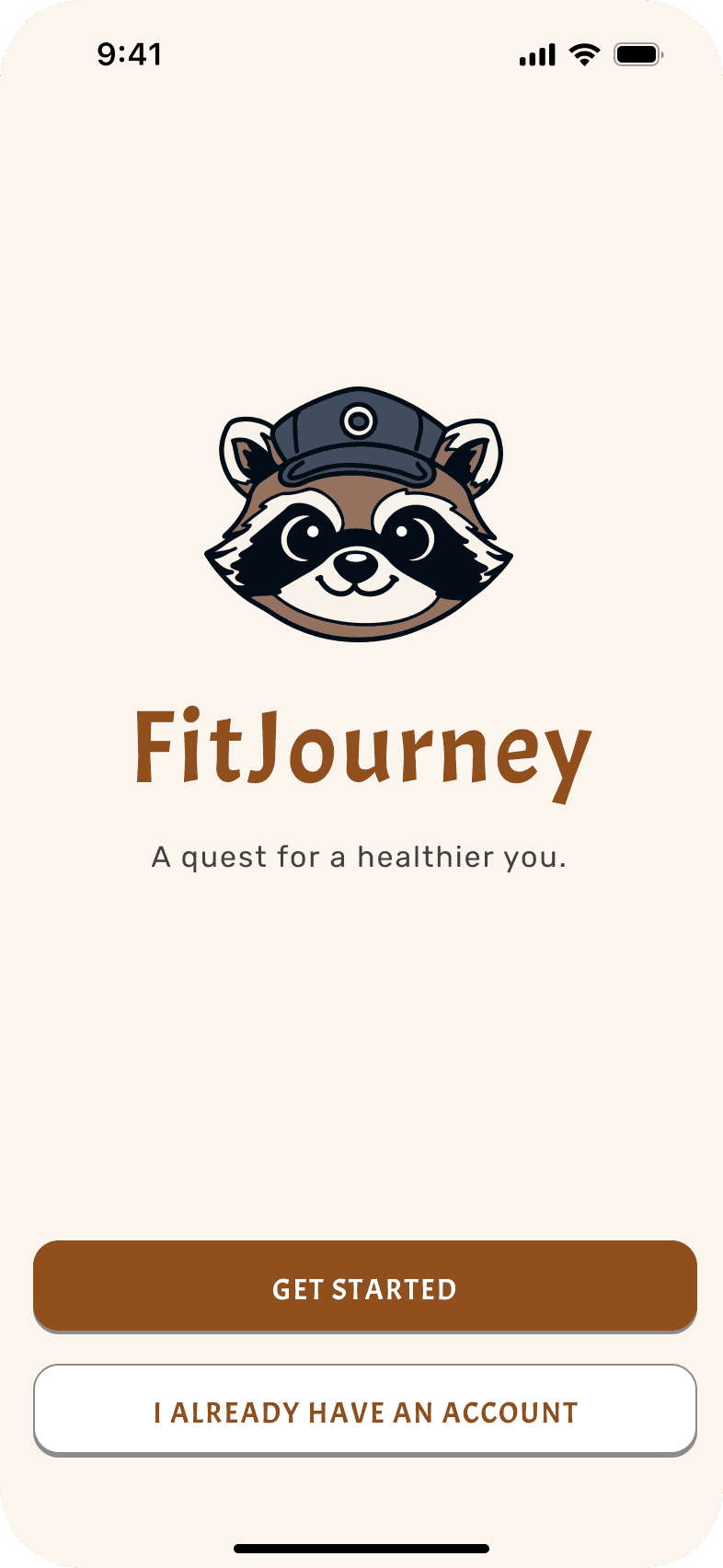
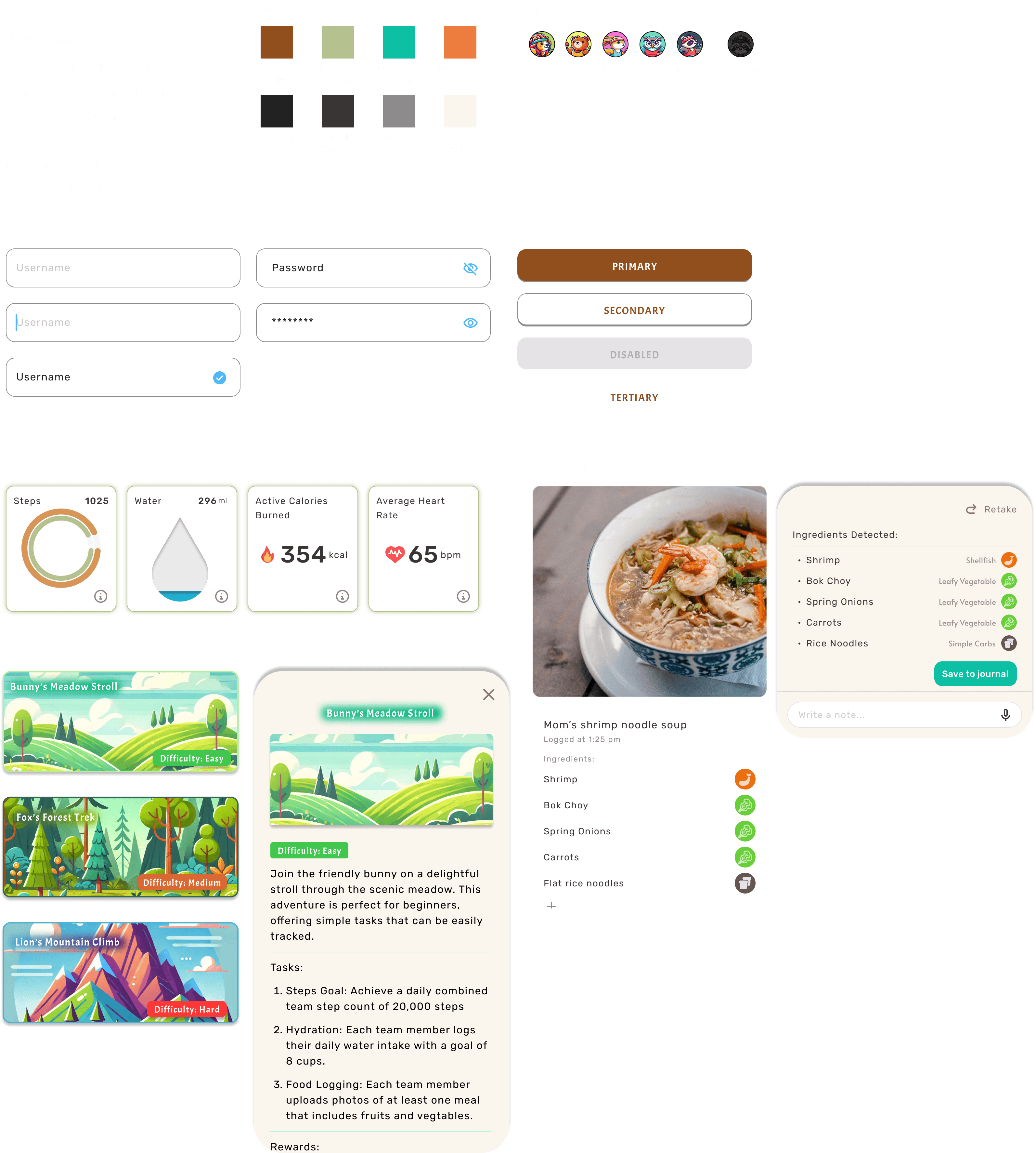
Taking inspiration from Duolingo, I wanted the brand to have a playful animal mascot. I decided to go with a raccoon, since they can represent curiosity, grit, and resourcefulness - 3 traits that would be valuable for someone undergoing a transformative health and fitness journey.
I prompted ChatGPT to create a playful cartoon-inspired raccoon mascot for the app. I dubbed him “Coach Rocky”.


UI Components
The components were created with fun, earthy colors to represent "adventure" and "journey". The cards and buttons were created with extra-rounded corners to promote the laid-back, casual vibe that the app aims for.
Usability Testing
Prototype
Using variables, I created a prototype that would allow me to test a few key user flows with test participants.
Flow 1: Onboarding & Joining a new Party Quest
Flow 2: Recording a new meal into the Food Journal
Flow 3: Viewing Party Quest statistics
Outcome
Testing and feedback did not show any critical errors within the user flows that would prevent users from achieving their task-related goals.
Iterations
Based on the feedback gathered, I’ve prioritized iterations based on the most perceived impact it would have on the user experience, with the least amount of effort required to design.
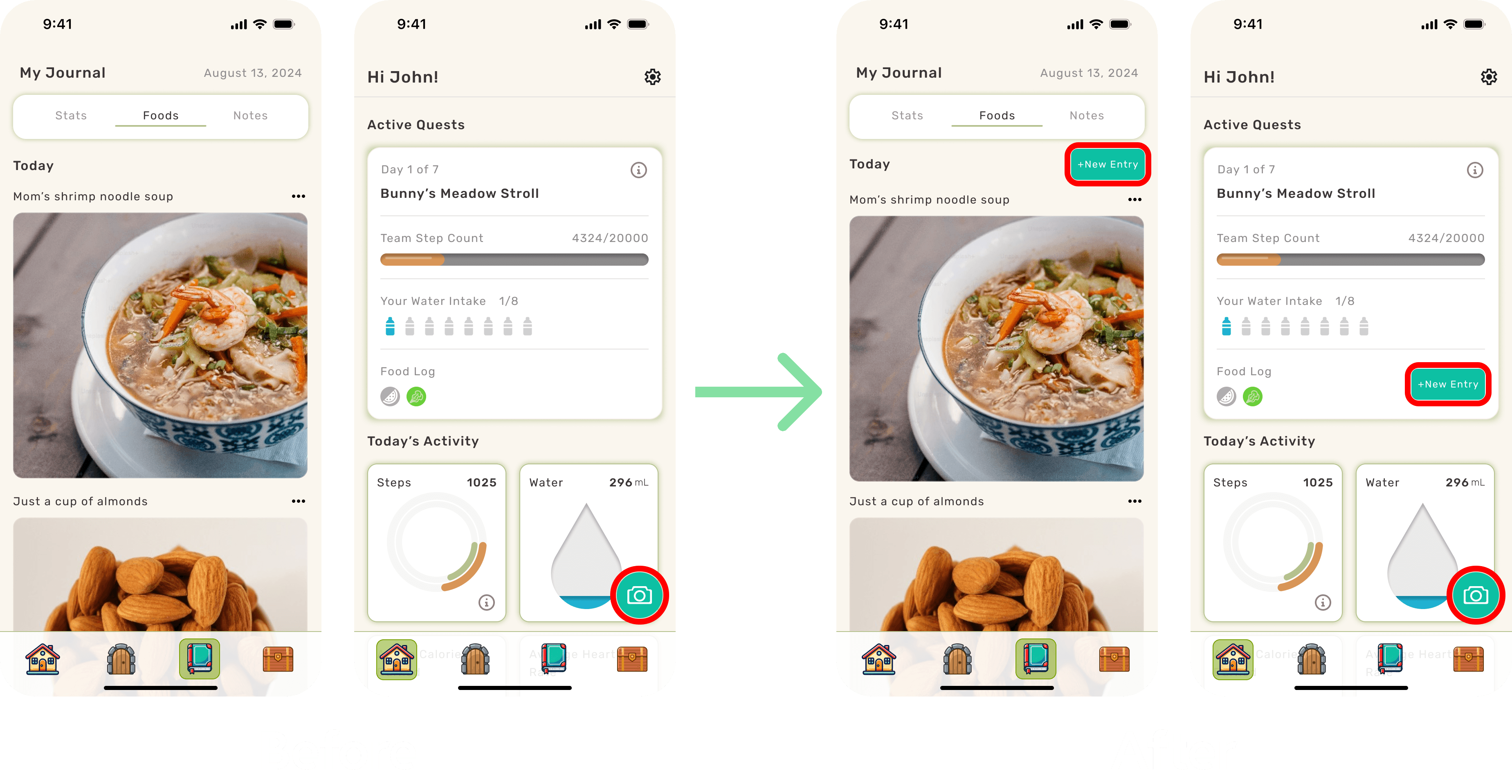
More access points for food logging
I’ve increased the primary points of access for the Food Camera from 1 to 3. Users should now find it more convenient to record food data.
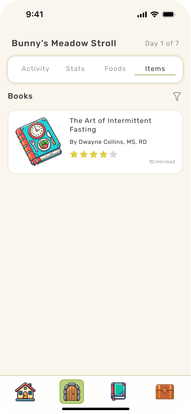
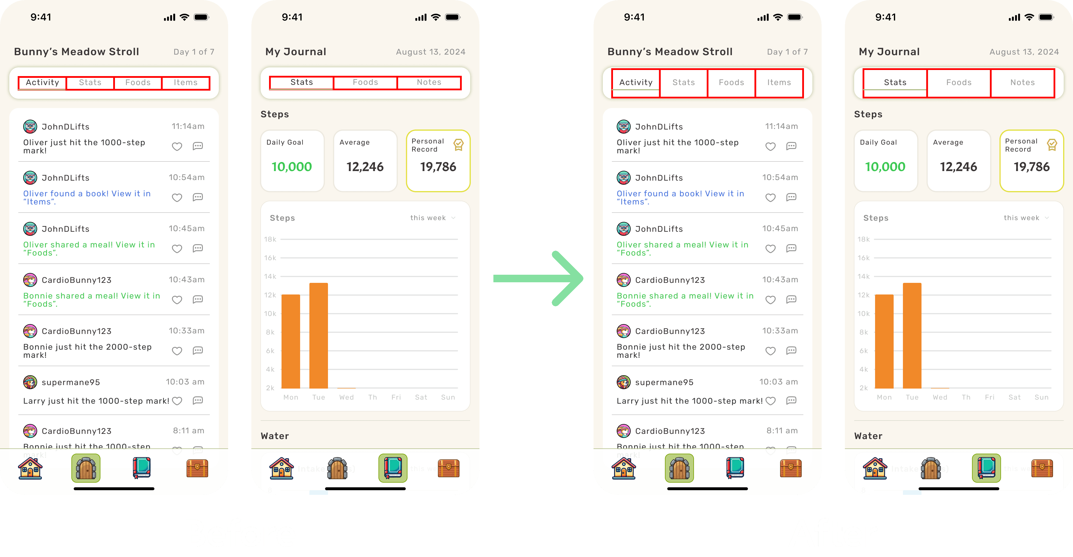
Increasing the tap radius for switching between tabs in Quests and Journal
I’ve expanded the tap radius on these tabs to make switching between them easier and more responsive. I’ve also included gesture controls to allow users to swipe between them.
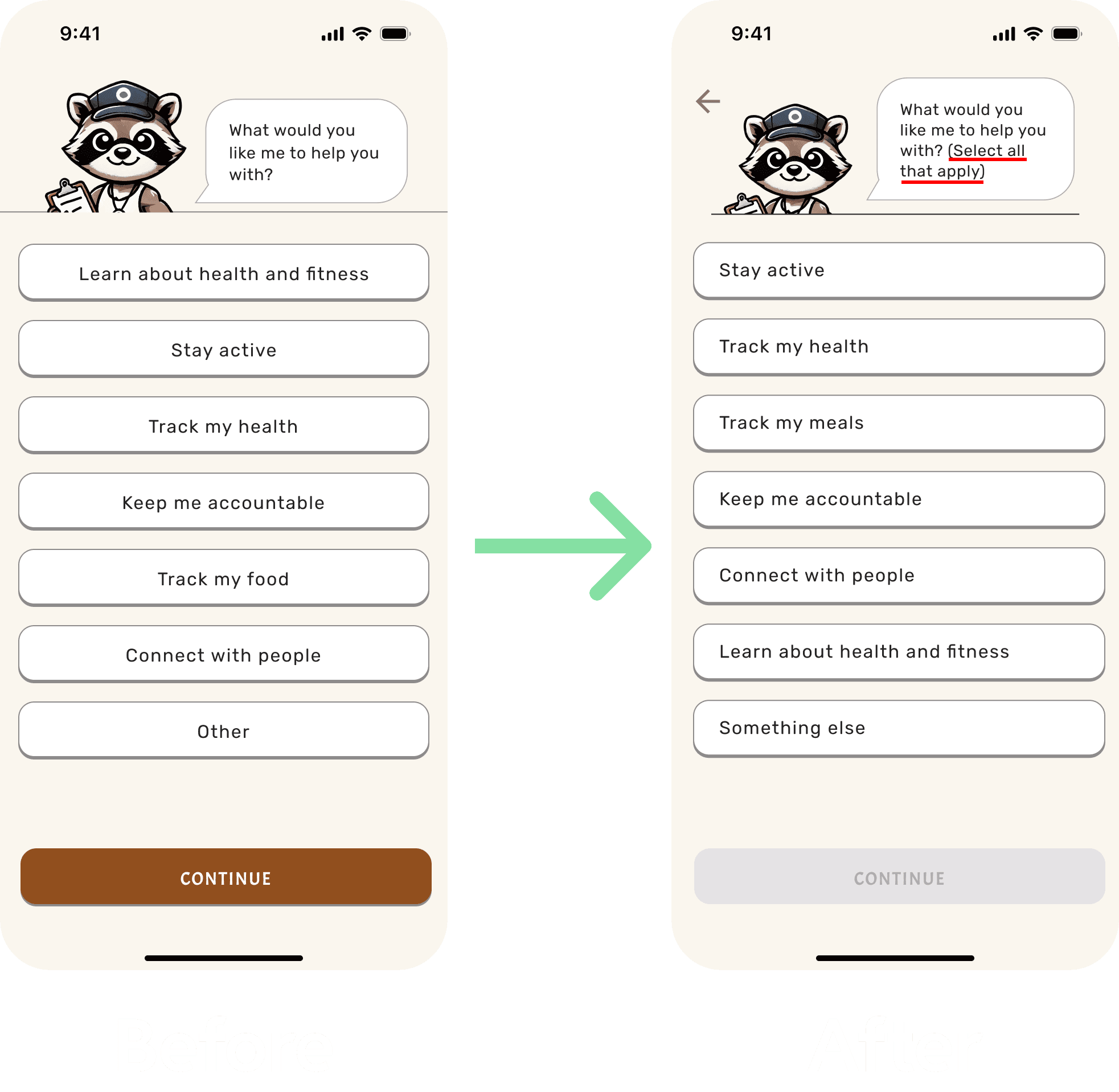
Informing users that more than 1 answer can be selected for this onboarding question
This was a simple, yet important fix because it will enable the app to provide better tailored recommendations and content based on the answers.
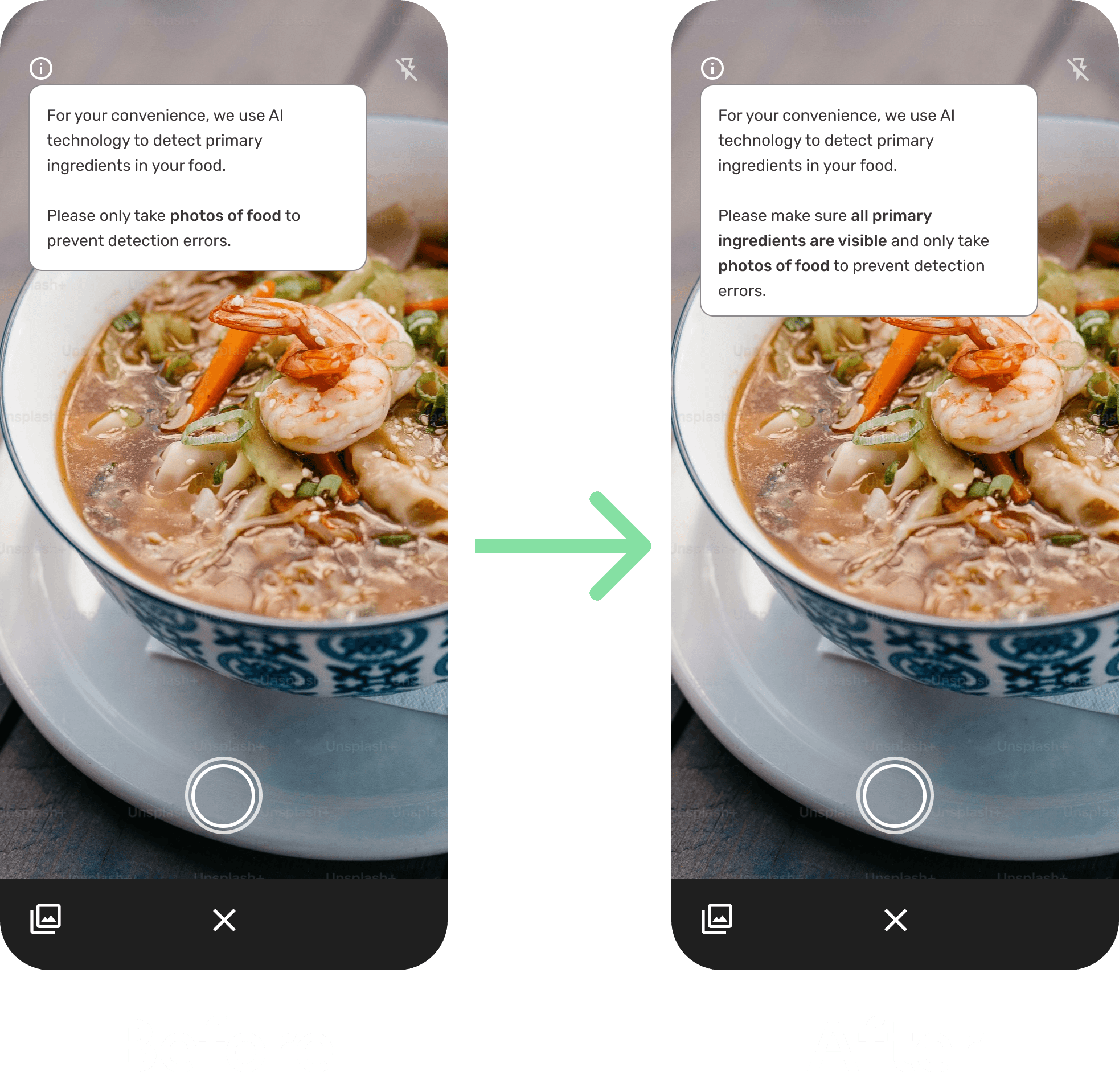
Including more detailed instructions for the Magic Food Camera
This important iteration will help improve the accuracy of the Magic Food Camera in detecting primary food ingredients.
Test Project Prototype
Key Takeaways
Lessons learned
There is a sizable audience that is resistant to traditional food-tracking and calorie counting methods, particularly with the growing popularity of intuitive eating.
AI can be implemented in creative ways to increase convenience and automation.
Accountability towards a social or friend group can be a key driver of motivation.
Challenges
Designing a health and fitness tracking app that accommodates this audience's resistance to traditional food-tracking methods, while still promoting healthy habits.
Deciding how to purpose AI and at which points within the flow to help with optimizing the user experience.
Designing a way to implement social accountability to motivate users to achieve a goal, while limiting negative psychological pressures that can occur when the goal is not reached.
